Kudos has partnered with CardRatings and Red Ventures for our coverage of credit card products. Kudos, CardRatings, and Red Ventures may receive a commission from card issuers. Kudos may receive commission from card issuers. Some of the card offers that appear on Kudos are from advertisers and may impact how and where card products appear on the site. Kudos tries to include as many card companies and offers as we are aware of, including offers from issuers that don't pay us, but we may not cover all card companies or all available card offers. You don't have to use our links, but we're grateful when you do!
Find Your Next Credit Card: Kudos' Explore Tool Revolutionizes Card Matching
July 1, 2025

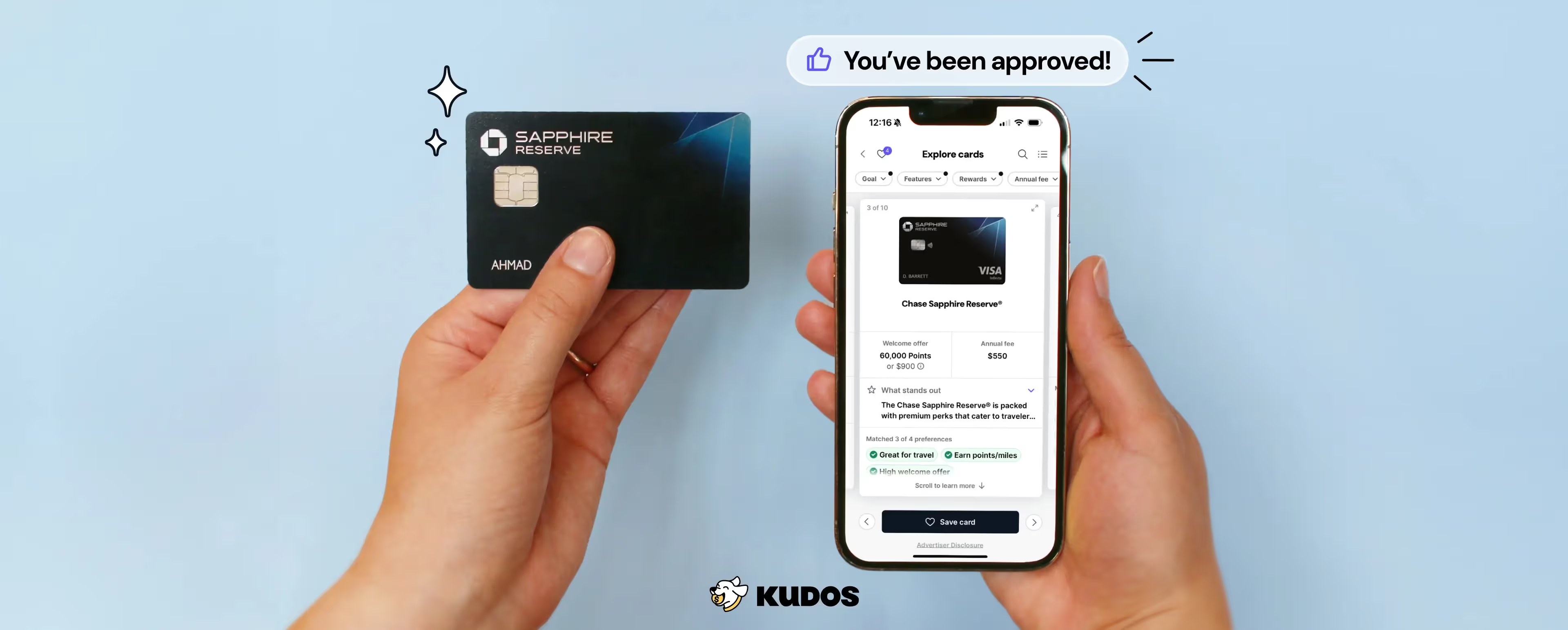
Are you wondering, "What credit card should I get?" With over 3,000 different types of credit cards in the USA, each with varying features, rewards, interest rates, and fees, it's no surprise that finding the right card can feel overwhelming. That's why here at Kudos, we wanted to take a people-first approach in creating a more humanized way to discover credit cards. After many prototypes, a lot of internal discussions, and most importantly, speaking with real people who are currently looking for a new credit card, we are proud to introduce the first iteration of what we think is the most personalized credit card discovery tool on the market.
Why Choosing the Right Credit Card Matters
Before we dive into how our Explore Tool works, let's quickly touch on why finding the right credit card is so important:
- Maximizing rewards that align with your spending habits
- Minimizing fees and interest rates
- Accessing perks that enhance your lifestyle
- Building credit responsibly
The current method for finding credit cards often leaves people wondering if the recommended results truly fit their unique needs. On top of that, many are skeptical about how genuine these recommendations are. That's why we at Kudos decided to take a people-first approach in creating a more humanized way to discover credit cards.
Find your perfect card with Kudos, a free AI-powered smart wallet that suggests the best card for each purchase to help you earn more credit card rewards, points, and cash back.
.gif)
Introducing Kudos' Explore Tool: Your Personal Credit Card Matchmaker
What you’ll first notice here is that we begin the search process by asking you what you are looking for in a credit card, such as a balance transfer card. Just as card recommendations are not one size fits all, different people have different needs when it comes to credit cards. Some might want to maximize their rewards, while others might look for cards that offer low interest rates. The process can differ depending on the credit card issuer.
Next, in our results, we clearly reflect that the cards we show you are related to what you just told us you care about in the quiz through our “preference matching” feature. This helps us build trust with you because we show you that our recommendations are personalized to you—not based on whether or not we earn commissions. For what it’s worth, there are some cards that we do earn commissions from and others that we earn $0 from. We show you all cards in our database, regardless of whether or not we earn a commission.

As you browse through your card recommendations, you’ll notice that we don’t push you to apply for the card right away. Instead, the main action here is the ability to easily save a card. Our team decided on this interaction because we know that most people do not apply for a card on the spot. Usually, what happens is that someone will want to save a card to research later, compare a few different options, or simply think about it a bit. In our Explore Cards feature, we’ve made this journey easy. After browsing through our catalog, you can easily compare the different cards you’ve saved. The best part is that you can compare all the credit card features of up to three cards at once. Credit card payments and their impact on credit scores are also important to consider. Having a good credit history is crucial when applying for credit cards.
.gif)
Our goal is to make sure that you have access to all the information you need to make an informed decision without feeling overwhelmed. And if you are still left with some unanswered questions, you can chat with our AI-powered finance assistant, MariaGPT, or send us an email at support@joinkudos.com. Finally, if you’re curious about our team’s product development process for this feature, we’ve shared a sneak peek below into how we brought this tool to life.
An Iterative Journey
Why do this now? We’ve seen a lot of people coming to our mobile app actually wanting to discover all the credit cards out there and find one that is their perfect match! Researching multiple cards from various credit card companies can be challenging, especially when it comes to keeping track of rewards and benefits. This got us thinking… “what if Kudos helped you find your perfect match? … but with a credit card.”
As we explored (pun intended) various designs, we knew we wanted to create a design that felt deeply intuitive to the surface to which you are getting card recommendations and responsive to your personal needs. We decided to experiment with the interaction of dating-style swiping apps but on credit cards to further enforce that concept of matching. Today, you read endless blogs, articles and bullet points on what card you should get. It’s completely one-sided. We wanted to mirror the experience of asking that credit card guru friend of yours what card you should get where: information is exchanged, goals are factored in, and opinions reshuffle the recommendation your friend gives you. As our design evolved, we felt it important to stick to these two principles: intuitive interaction and a conversational match.

As we began to build out the prototypes for this new tool we were imagining, we knew some of the interactions we wanted to pursue were atypical for fintech products (à la the Tinder-inspired swiping). So, we decided to dedicate a sprint to user testing our ideas. Through in-depth conversations with our participants, we were able to redesign our end product based on these key learnings:
- The swiping interaction became a burden for users. To start, most people did not stop to watch the tutorial, and even when they did, they quickly forgot what the left or right swiping gestures actually did to a card. In addition, people felt anxious about being asked to make a choice within each result (“Do I get rid of it? Or do I save it?”) rather than being able to freely browse. Even though we had spent a lot of time designing and prototyping the swiping interaction, it quickly became clear that we needed to rethink this interaction. We retained what users actually liked about the swiping view, which was how much real estate was dedicated to each card and the ability to easily scroll through details without needing to click into the result. Eventually, we landed on the carousel view that we currently have.
- How someone browses through search results is very personal. Some prefer to quickly swipe through to get a quick peek at all their options (what we internally call “breadth-first” search), while others prefer to read into the details of each option as they swipe through (what we internally call “depth-first” search). Our UX subtly reflects the ability to accommodate this search preference pattern. If you are a breadth-first person, you can quickly swipe through the list in our default carousel view, or you can click the top-right “list” icon to change the view to the standard list view to swipe through even faster. If you are depth-first, the default carousel view allows you to seamlessly scroll down to access the credit card details. This enables you to browse your options with natural hand motions rather than needing to click into and out of screens.
- Analysis paralysis is real! This quickly became a guiding principle for our designs. We wanted to make sure users weren’t doom-scrolling through a seemingly endless list of cards. Our final iteration of our designs intentionally presents only the top 10 cards, ranked by the card’s general popularity and how closely they match your personalization quiz. As you finish scrolling through the first batch, we include options to start comparing cards if you’ve saved any, adjust your filters to refine results, or simply load more cards.
- Even after going through a personalization quiz, users still had some skepticism about the results that were being shown. It seemed people couldn’t help but wonder if we were pushing certain cards onto them. This realization inspired us to introduce the “preference matching” feature, which clearly tells users how closely a result matches the preferences they told us they cared about. While this addition appears deceptively simple, our engineering team encountered significant challenges related to search performance and result quality. The tool is designed to rank credit cards based on a variety of user preferences, ensuring higher prioritization for cards that match a greater number of search preference attributes. Initially, the implementation utilized Painless scripting within Amazon OpenSearch to determine at search-time which cards met the criteria for each predetermined preference. Preferences considered include annual fees, cashback rates, and specific user benefits such as dining or travel rewards. It quickly became apparent that performing these calculations dynamically across thousands of cards would be both slow and costly.The ultimate solution involved determining the necessary attributes for preference matching during the indexing of cards in OpenSearch. Finally, Painless scripting was employed in a more lightweight capacity, maintaining the flexibility needed for high-quality search results, such as assigning weights to each preference based on the factors most important to users when searching for a card. Although this addition clearly increased the scope of the project, we were confident that this feature was worth the investment.

Ready to Find Your Perfect Credit Card?
Your feedback shapes our products! We believe that by offering you super personalized and relevant credit card recommendations, we'll earn your trust. And when you trust us, you're more likely to use Kudos and tell your friends about us when it's time to apply for a new card. Simply put: We listen, we customize, you benefit, and hopefully, you'll spread the word!
If you or someone you know is in the market for a new credit card, check out our new tool and let us know what you think!
Frequently Asked Questions
How does Kudos' Explore Tool help me choose a credit card?
Our tool asks about your rewards preferences, then uses this information to provide personalized credit card recommendations tailored to your needs.
Can I compare different credit cards using the Explore Tool?
Yes, you can easily save and compare up to three different credit cards side-by-side, allowing you to make an informed decision.
Is Kudos' credit card recommendation tool free to use?
Yes, the Explore Tool is completely free to use. We show all 3000 cards in our database, regardless of whether we earn a commission. We don't make a commission from 96% of the cards in our Explore Tool!
How often should I reassess my credit card choices?
It's a good idea to reassess your credit card choices annually or when there are significant changes in your financial situation or spending habits.
Does Kudos push me to apply for a specific card?
No, we don't push you to apply for any specific card. Our goal is to provide personalized recommendations and let you make the decision that's best for you.
Unlock your extra benefits when you become a Kudos member

Turn your online shopping into even more rewards

Join over 400,000 members simplifying their finances

Editorial Disclosure: Opinions expressed here are those of Kudos alone, not those of any bank, credit card issuer, hotel, airline, or other entity. This content has not been reviewed, approved or otherwise endorsed by any of the entities included within the post.






.webp)
